

The internet was built to connect humanity, yet for billions of people, it remains a space full of invisible walls. A slow-loading page, a video without captions, a form that cannot be navigated by keyboard, these are not minor inconveniences. For users with disabilities, they are dead ends.
According to the World Health Organisation, approximately 16% of the global population, around 1.3 billion people, live with some form of significant disability. Yet inaccessible design continues to shut them out of digital spaces every day. Creating inclusive online experiences is not just a compliance exercise. It is a commitment to building a web that works for every person who uses it, regardless of how they see, hear, move, or process information.
This guide walks you through exactly how to do that, section by section, with actionable steps you can apply to your website, content, and development process today.
1. Understand the Full Range of Users You Are Designing For
Inclusive design starts before you write a single line of code or place a single element on a page. It starts with understanding who your users actually are, and that group is far broader than most teams assume.
Disability is not a single condition. It spans a wide spectrum, and many people experience more than one form simultaneously. When designing, you need to account for:
- Visual impairments: Ranging from full blindness to low vision, colour blindness, and contrast sensitivity. These users may rely on screen readers like NVDA or VoiceOver, or use browser zoom at 200% or higher.
- Hearing impairments: Including complete deafness and partial hearing loss, affecting over 430 million people worldwide, according to the WHO. Captions, transcripts, and visual alerts are essential for this group.
- Motor impairments: Conditions like arthritis, Parkinson’s, or paralysis that make using a mouse difficult or impossible. These users navigate using keyboards, switch devices, or use voice control software.
- Cognitive and learning differences: Including dyslexia, ADHD, autism, and memory impairments. Plain language, consistent layouts, and distraction-free interfaces make a significant difference.
Build these user types into your design process from day one. Create accessibility personas, run usability tests with disabled participants, and review every feature against each impairment type before release.
2. Follow the WCAG Guidelines as Your Baseline Standard
The Web Content Accessibility Guidelines (WCAG), published by the W3C, are the internationally recognised standard for digital accessibility. They are also the legal benchmark in many jurisdictions, including the US (ADA), the UK (Equality Act), and across the EU under the European Accessibility Act, which came into force in June 2025.
WCAG is built on four principles: Perceivable, Operable, Understandable, and Robust and comes in three conformance levels: A, AA, and AAA. WCAG 2.1 Level AA is the minimum target for most organisations.
Despite WCAG being freely available and extensively documented, 94.8% of websites still fail at least one detectable accessibility check according to the 2025 WebAIM Million report, meaning the vast majority of sites on the open web are still not meeting the baseline standard. Starting with WCAG 2.1 AA compliance is not optional it is the floor, not the ceiling.
3. Design Visual Content That Everyone Can Access
Visual elements, such as images, infographics, data charts, icons, and illustrations, are often the first place accessibility breaks down. Getting them right requires attention at both the design and content stages.
Write meaningful alt text for every image
- Describe the purpose and meaning of the image, not just its appearance. A chart showing a 40% year-on-year revenue increase needs alt text that communicates that trend, not simply “bar chart.”
- Use an empty alt attribute (alt=””) for purely decorative images so screen readers skip them.
- For complex images like infographics or diagrams, provide a longer description in the surrounding text or via a linked transcript.
- Never use images; use real, styled text instead, which can be read, resized, and translated.
Fix colour contrast before launch
- Maintain a contrast ratio of at least 4.5:1 between text and its background for normal text, and 3:1 for large text (18pt or 14pt bold).
- Do not rely on colour alone to communicate status; for example, use an icon or label alongside a red error state.
- Test all colour combinations in your palette using a contrast checker tool during the design phase, not after.
- Low-contrast text affected 79.1% of home pages in the 2025 WebAIM analysis. It is the single most common and most fixable accessibility failure on the web.
Make data visualisations accessible
- Always include a text summary of what the chart shows, the key insight, not just labels.
- Use patterns or textures alongside colour to distinguish data series for colour-blind users.
- Provide the underlying data in an accessible table format alongside any chart.
4. Make All Video and Audio Content Accessible
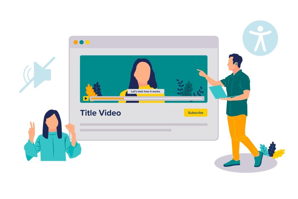
Video is the fastest-growing content format online, yet it is consistently one of the least accessible. With over 430 million people worldwide living with disabling hearing loss, inaccessible video content excludes a massive portion of your potential audience.
Add captions to every video
- Provide closed captions for all pre-recorded video content, not just a transcript, but time-synced captions that appear as the audio plays.
- Review auto-generated captions carefully before publishing. Accuracy rates for automated tools still vary significantly, particularly for accented speech, technical vocabulary, and proper nouns.
- For live video, use real-time captioning services (CART) or AI-powered live captioning tools.
Provide transcripts and audio descriptions
- Publish full transcripts alongside all audio and video content. Transcripts help users who cannot or prefer not to watch a video, and they make your content indexable by search engines.
- Add audio descriptions for video content where important information is conveyed visually, for example, a product demonstration, a training walkthrough, or a slide presentation.
For organisations producing large volumes of video content, working with a specialist partner that provides video accessibility services, including professional captioning, transcription, and audio description, ensures both accuracy and compliance at scale.
Handle audio-only content
- Provide full transcripts for all podcasts, audio guides, and voice-based content.
- If your audio content uses background music or sound effects, ensure they do not obscure the spoken content for users with partial hearing.
5. Build Full Keyboard and Assistive Technology Support
A significant portion of users with motor impairments, visual impairments, or both rely on keyboard navigation and assistive technologies rather than a mouse or touchscreen. Building support for these interaction methods is non-negotiable for inclusive design.
Ensure complete keyboard accessibility
- Every interactive element, links, buttons, form fields, dropdowns, modals, and carousels, must be reachable and operable using Tab, Shift+Tab, Enter, Space, and arrow keys.
- Never suppress the browser’s default focus indicator without replacing it with a clearly visible alternative. Users who navigate by keyboard need to see exactly where they are on the page at all times.
- Modals and overlays must trap focus within themselves while open and return focus to the triggering element when closed.
- Test your entire user journey from landing page to checkout or form submission using only a keyboard, with no mouse input at all.
Test with real screen readers
- NVDA (Windows, free), VoiceOver (Mac and iOS, built-in), and TalkBack (Android, built-in) are the most widely used screen readers. Test with at least two.
- Ensure all interactive elements have descriptive accessible names. A button that says only “click here”, or an icon link with no label, is unusable for screen reader users.
- Announce dynamic content changes when a form error appears, when a modal opens, or when a page section updates using ARIA live regions.
- Use semantic HTML first. A native <button> element requires no ARIA to be accessible; a custom div styled as a button requires significant additional work to achieve the same result.
Use ARIA only where necessary
- ARIA (Accessible Rich Internet Applications) attributes extend HTML for complex interactive components. Use them only when native HTML cannot achieve the required semantics.
- Never use ARIA to fix broken HTML. The first rule of ARIA is: if you can use a native HTML element with the right semantics, do that instead.
- Test every ARIA implementation with a screen reader. Incorrectly applying ARIA can make an experience worse than having no ARIA at all.
6. Write Content That Is Clear and Easy to Understand
Accessibility is not only a technical concern; the clarity and structure of your written content is just as important. Users with cognitive differences, low literacy, dyslexia, or who are reading in a second language all benefit from content that is well-organised and plainly written.
Use plain, direct language
- Write at approximately a Grade 8 reading level for general audiences. Use the Hemingway Editor or Readable.com to check your content before publishing.
- Use short sentences and short paragraphs. Aim for one idea per paragraph and no more than 20-25 words per sentence on average.
- Spell out acronyms on first use. Never assume the reader shares your institutional vocabulary.
- Use an active voice. “Submit the form” is clearer than “The form should be submitted.”
Structure content with proper heading hierarchy
- Use one H1 per page for the main topic. Use H2 for major sections, H3 for subsections within those. Never skip levels.
- Headings should describe the content that follows, not just label a section. “How to Write Alt Text for Images” is better than “Image Accessibility.”
- Screen reader users often navigate a page by jumping between headings. A clear heading structure acts as a table of contents for the entire page.
Make links descriptive
- Link text must make sense out of context. “Click here” and “Read more” are meaningless when read by a screen reader announcing a list of links on the page.
- Use descriptive anchor text that tells the user where the link goes or what the linked content covers. Two to four words are usually sufficient.
- Do not open links in a new tab without warning the user. Unexpected tab behaviour disorients screen reader and keyboard users.
7. Design Accessible Forms and Error Handling
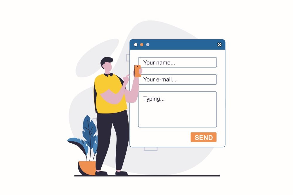
Forms are where many users complete critical tasks, such as registrations, purchases, contact submissions, applications. They are also among the most consistently inaccessible elements on the web. Getting form accessibility right is one of the highest-impact things you can do.
- Label every form field explicitly. Use a visible <label> element associated with each input; never rely on placeholder text alone, which disappears when the user starts typing.
- Group related fields with <fieldset> and <legend>, particularly for radio buttons, checkboxes, and multi-step forms.
- Make error messages specific and helpful. “Email is invalid” is not enough. Tell users what format is expected: “Please enter your email in the format name@example.com.”
- Place error messages adjacent to the field they relate to, not only at the top of the page. Use colour and an icon together, never colour alone, to indicate an error state.
- Ensure sufficient time for form completion. If sessions expire, warn users in advance and give them the option to extend.
- For multi-step forms, show progress clearly and allow users to go back and edit previous steps without losing data.
- Never auto-advance to the next field; let users control their own navigation through the form.
8. Test With Real Users and Automated Tools
Accessibility is not a one-time audit. It requires continuous testing as your site evolves, new features are added, and content is updated. No single method catches everything; the most effective approach combines automated scanning, manual testing, and testing with disabled users.
Use automated scanning tools
- Tools like WAVE, axe-core, and Google Lighthouse are free and easy to integrate into your development workflow. Run them on every page, not just your homepage.
- Automated tools catch well-defined, detectable issues such as missing alt text, low contrast ratios, missing form labels, and invalid ARIA. However, they identify only approximately 30–40% of actual accessibility barriers; the rest require human judgment.
- Integrate accessibility scanning into your CI/CD pipeline so issues are caught during development, not after deployment.
Conduct manual testing
- Navigate your site with keyboard only, no mouse. Test every interactive element and every user flow.
- Testing with at least two screen readers: NVDA on Windows and VoiceOver on Mac or iOS, covers the majority of real-world screen reader usage.
- Test at 200% browser zoom to ensure no content is cut off or overlapping.
- Test on mobile devices, both with touch and with assistive technology like TalkBack or VoiceOver on iOS.
Involve disabled users in testing
- Recruit users with disabilities as part of your regular usability testing programme. Their experience will surface issues no automated tool or non-disabled tester could find.
- Work with accessibility consultants who have lived experience of the impairments you are designing for.
- Document all findings and track them to resolution. Accessibility testing is only valuable if it leads to fixes.
Conclusion
Creating inclusive online experiences is not a single project with an end date. It is a practice woven into how you design, build, write, and test everything you publish online. The steps in this guide are not exhaustive, but they cover the most impactful areas: knowing your users, meeting accessibility standards, making visual and multimedia content accessible, building for keyboard and assistive technology users, writing clearly, designing accessible forms, and testing continuously.
The business case is equally compelling. People with disabilities represent a $13 trillion consumer market in the US alone, yet 69% of disabled users abandon inaccessible websites, taking their spending elsewhere. Companies that lead on disability inclusion generate 1.6× more revenue and 2.6× more net income than peers. Accessibility and business performance are not in tension. They move in the same direction.
Start where you are. Run an audit. Fix your contrast. Caption your videos. Label your forms. Then build from there because every improvement you make opens your digital experience to more people, and that is exactly what the web was built to do.
Author Bio

Emilie Brown works with the Content Marketing team at Continual Engine, a leading AI-based accessibility solutions provider that enables organizations to create digitally accessible content in compliance with universal accessibility laws. Her approach and methodology are simple, concise, and direct, connecting with readers seeking solution-driven content on accessibility and remediation topics. Apart from working, she loves spending time with her dog, volunteering, and playing her guitar.